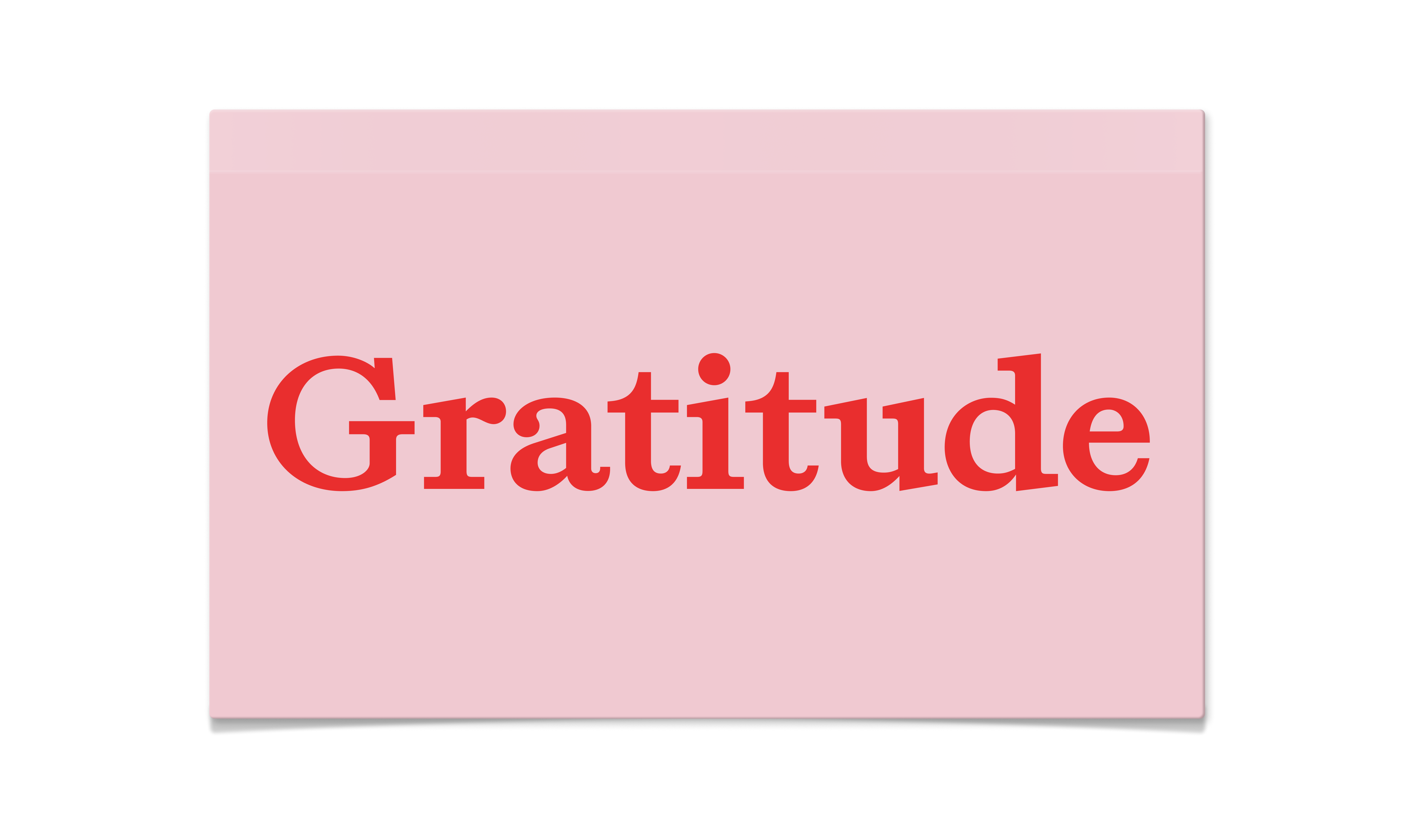
Gratitude

Light Light Italic Regular Italic Semibold Semibold Italic Bold Bold Italic
Gratitude deliberately merges two typographic traditions that rarely converse. The cool precision of slab serifs with the warm personality of elzevir styles. The result, is a typeface that evolves across its weight spectrum, beginning with lighter cuts that embrace the clinical efficiency and geometric clarity of slabs. As weights increase, Gratitude gradually introduces the expressive, humanist characteristics of elzevirs, allowing the bold weights to exude warmth and personality. This temperature shift (from analytical lightness to emotive boldness) creates a family that functions with both a rational and expressive voice. Each weight tells its own story while maintaining the core DNA that unifies the family, offering a spectrum of typographic temperature.

Supported languages

Afrikaans
Albanian
Asu
Basque
Bemba
Bena
Breton
Catalan
Chiga
Colognian
Cornish
Croatian
Czech
Danish
Dutch
Embu
English
Esperanto
Estonian
Faroese
Filipino
French
Friulian
Galician
Ganda
German
Gusii
Hawaiian
Hungarian
Icelandic
Inari Sami
Indonesian
Irish
Italian
Jola-Fonyi
Kabuverdianu
Kalaallisut
Kalenjin
Kamba
Kikuyu
Kinyarwanda
Latvian
Lingala
Lithuanian
Lower Sorbian
Luo
Luxembourgish
Luyia
Machame
Makhuwa-Meetto
Makonde
Malagasy
Maltese
Manx
Meru
Morisyen
Northern Sami
North Ndebele
Norwegian Bokmål
Norwegian Nynorsk
Nyankole
Oromo
Polish
Portuguese
Prussian
Quechua
Romanian
Romansh
Rombo
Rundi
Rwa
Samburu
Sango
Sangu
Scottish Gaelic
Sena
Serbian
Shambala
Shona
Slovak
Slovenian
Soga
Somali
Spanish
Swahili
Swedish
Swiss German
Taita
Teso
Tongan
Turkish
Upper Sorbian
Uzbek
Volapük
Vunjo
Walser
Welsh
Western Frisian
Zulu